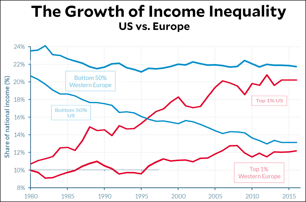
The World Inequality Database is out with its 2018 report, and of course not much has changed. After all, how much could it change in a single year? Still, we don’t often venture outside the US when we talk about income inequality, so it’s worth taking a look around the world occasionally. First up, here is the US vs. Europe:

Income inequality has grown in Europe, but not nearly as dramatically as in the US. In both places, the rich started out with roughly a 10 percent share of national income, but by 2016 that had increased to only 12 percent in Europe while it skyrocketed to 20 percent in the US. Likewise, the middle class in Europe started out with a 24 percent share of income and now have 22 percent. The American middle class can only dream of such largesse. They started out with a lower share of income than their European comrades and have since plummeted to about 13 percent. Obviously, growing inequality isn’t inevitable: it’s the result of very deliberate policy choices
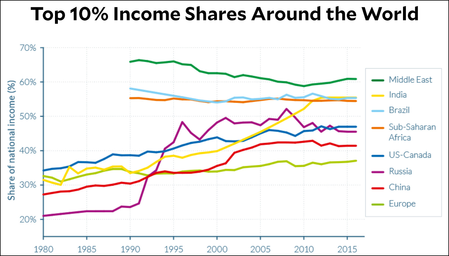
Now let’s widen our view even more and look at the entire world:

The Middle East, Brazil, and Africa started out with the highest inequality in the world, but at least they’ve come down a bit since 1990. Russian income inequality skyrocketed in the 90s when Boris Yeltsin and his American advisors basically gave away the entire country to the oligarchs. India went crazy starting around 1990, while income inequality in China and the US has been steadily increasing the entire time, kicked off by Ronald Reagan in the US and Deng Xiaoping in China. Meanwhile, only Europe has made a real effort to rein in the effects of globalization, financialization, and liberated capital.
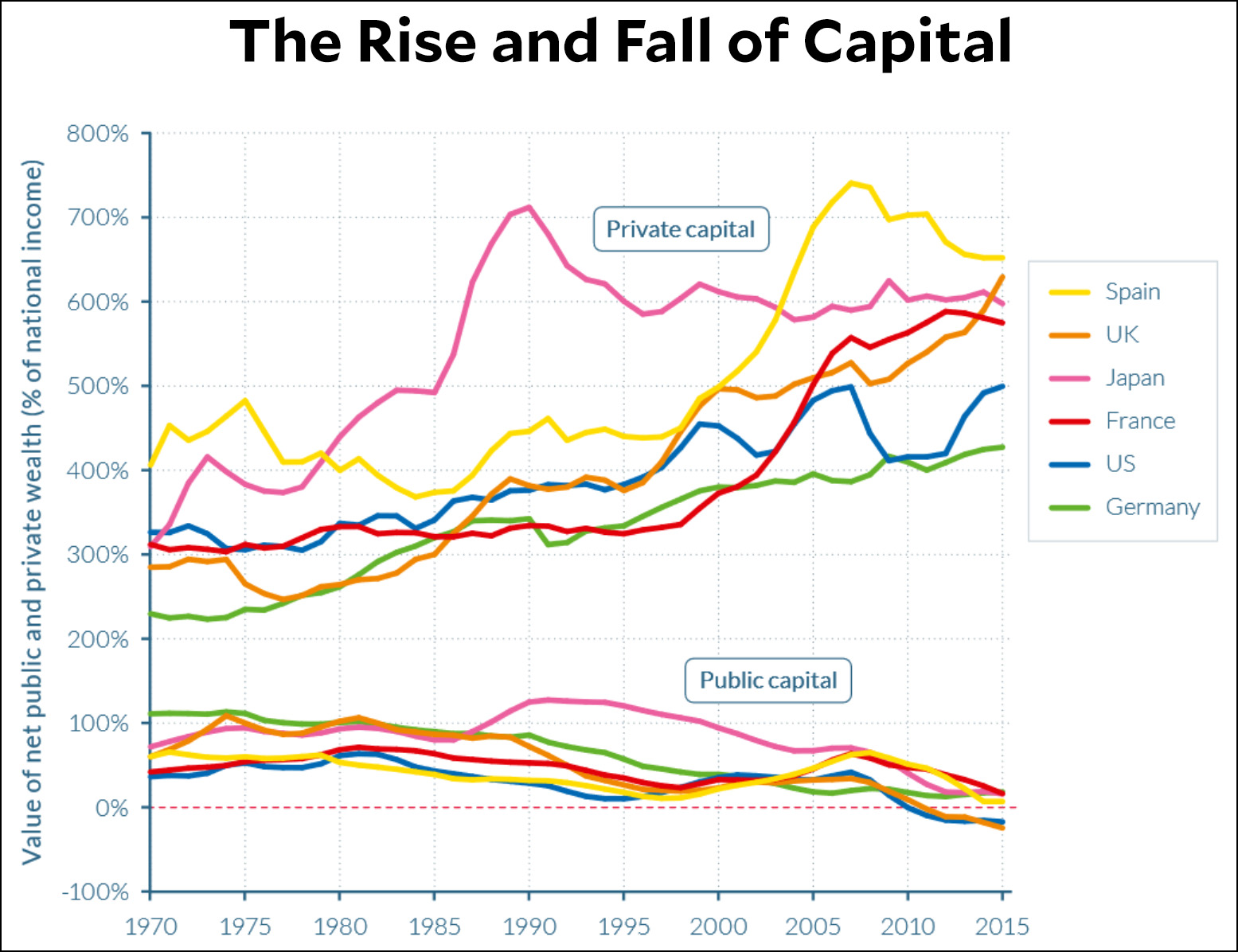
And speaking of liberated capital, check out this chart:

Public capital has shrunk nearly to zero nearly everywhere since 1970. In fact, it’s shrunk to less than zero in the US and Britain. So who has all the capital now? Private wealth holders, of course.
You can download the full report here, or the executive summary here, in English, French, or Chinese.


