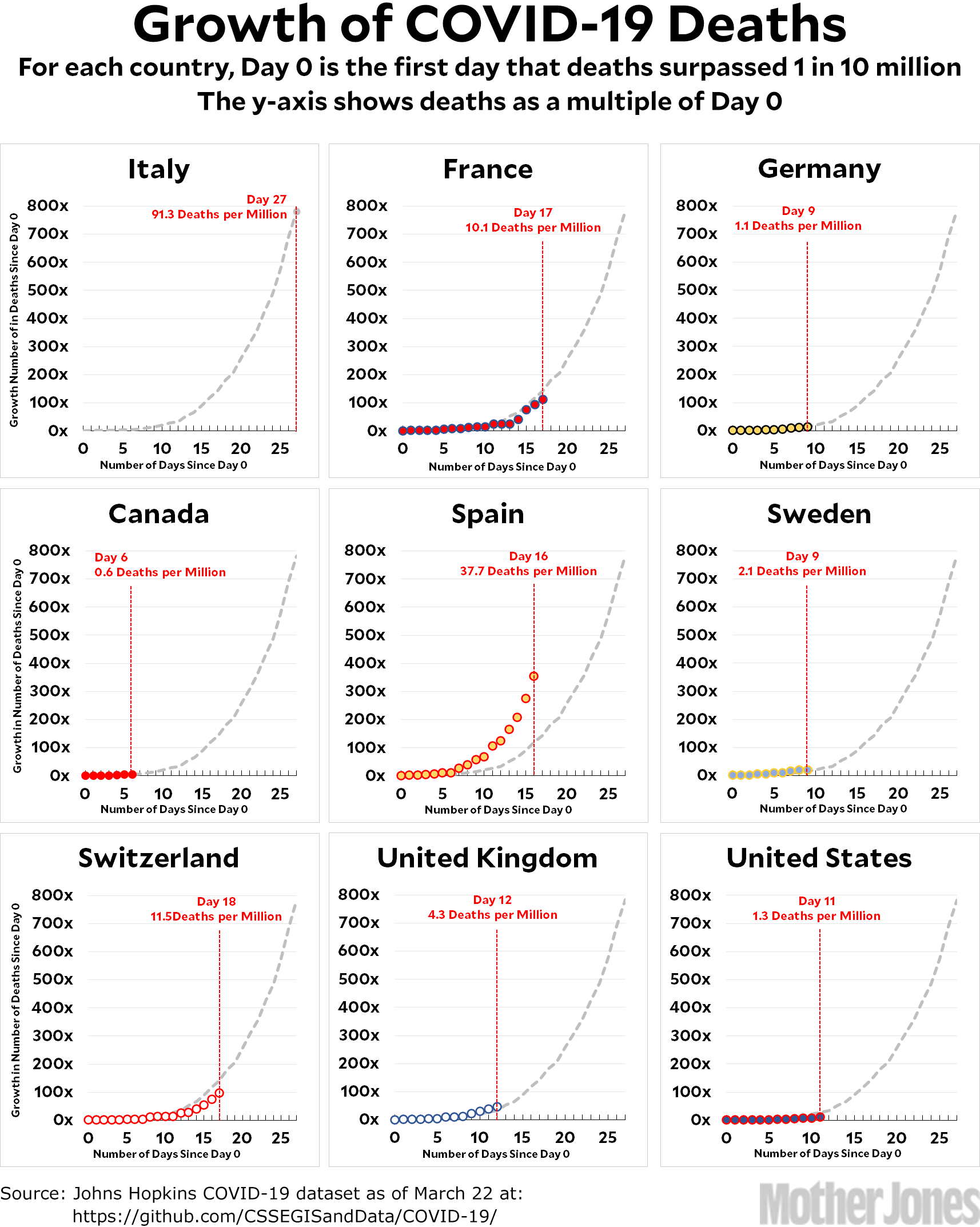
Here’s the coronavirus growth rate through Sunday. If you squint, it looks like a couple of countries are flattening slightly compared to the Italian trendline, but it’s way too early to tell if this is for real or not.
I get asked a lot why I don’t just show the absolute number of deaths (or deaths per million) on the y-axis. The answer is simple: what matters is the growth rate, and that’s what I want everyone to focus on. The countermeasures we started taking last week—if they’re working—will start to show up as a flattening of the growth curve in another week or two. That flattening is what we’re aiming for.
Right now, for example, the growth rate for the United States is roughly 25 percent per day. That will get us up to 50,000 deaths in three weeks and a quarter of a million in four weeks, so we’d better hope that we start to flatten that curve sometime very soon.
Here’s how to read the charts: Let’s use France as an example. For them, Day 0 was March 5, when they surpassed one death per 10 million by recording their sixth death. They are currently at Day 17; total deaths are at 112x their initial level; and they have recorded a total of 10.1 deaths per million so far. As the chart shows, this is slightly below where Italy was on their Day 17.
The raw data from Johns Hopkins is here.


