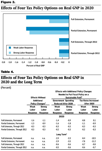
This is arcane, but I guess I need to follow up on my post last night about the CBO’s report on extending tax cuts. I think I’ve figured out what’s going on.
The CBO chart is below, and it doesn’t seem to match the data in Table 4. But it does, sort of. Take the bar for full extension of tax cuts with a weak labor response. According to Table 4, its effect in 2020 is to reduce real GNP by 1.6%. That’s if everyone assumes there’s no response. But if we assume that government spending will be reduced after 2020, a lifecycle model predicts that the net effect of extension is only -1.4%. If we assume a tax increase after 2020, the lifecycle model predicts that the net effect is -0.8%.
Now average all those together and you get -1.26%. That rounds to -1.3%, and that’s what’s shown in the chart. If you average all the other options they also match the chart.
Is this simple arithmetic averaging legit? Beats me. And I’m not even sure who to ask. But apparently that’s what they did.
One more thing, though. The CBO model suggests that in all cases, a policy response to full extension of the tax cuts reduces the long-term damage. However, a policy response to extension of just the middle-class cuts increases the long-term damage or has only a tiny effect. This seems like a very strange result. Why does a policy response (either lower spending or higher taxes) have a strongly positive effect in one case and a bad or negligible effect in the other? Again, I’m not even sure who to ask. But it seems odd even if you’re a supply side die hard.


