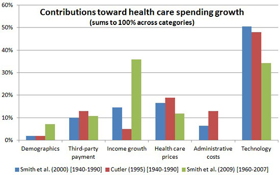
I don’t have much of an instant reaction to this, but the chart below from Austin Frakt is pretty interesting. It shows three different estimates of what has contributed most toward the growth in healthcare spending. Two of the estimates (blue and red) are for 1940-1990 and one of them (green) is for 1960-2007. All of them lay a big part of the blame on all the shiny new technology that we’re so eager to use (and use and use and use), and the most recent estimate also lays a lot of the blame on rising incomes (as incomes go up, we actively want to spend a bigger share of our income on healthcare). The other categories get smaller, but somewhat different shares of the blame from each of the three studies.
Austin has a few more comments at the link.


