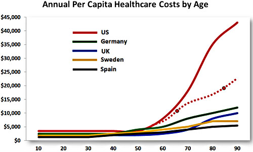
Austin Frakt has a chart up today showing that healthcare costs for the elderly are fantastically higher in the United States than they are in other similar countries. However, the vagueness of his note that the chart “is, apparently, from a year 2005 study,” immediately set off my spidey sense. The link goes to a news article about an engineering professor who created the chart based on data “drawn from a 2005 study done by Boston University economist Lawrence Kotlikoff and his colleagues.”
Kotlikoff’s data might well be right, but it’s worth at least a little bit of skepticism. A study published in Health Affairs using data through 2004 says that per capita healthcare spending for those 65+ is about $15,000, which suggests that a decent point estimate for those exactly age 65 is around $10,000 or so. Likewise, the estimate for those 85+ is $25,000, which suggests that a good point estimate for those exactly age 85 is perhaps $20,000 or so.
Using these two numbers, I drew a new line for the United States onto the chart in Austin’s post. It’s the dashed line below, and although it’s still a lot higher than the other four countries, it’s not quite as scary looking. If anyone knows of a more authoritative international comparison by age cohort, I’d be happy to post it. In the meantime, I suspect that U.S. spending levels are just in the normal scary range—which we already knew—not the mega-scary range suggested in the original chart.
UPDATE: Judging from the comments to Austin’s post, this chart is bogus. Aside from the fact that costs at the high end might be overstated, it includes only public spending, which is very low in the U.S. for those under 65. So the spike at age 65 is artificial. Also, several countries are omitted, making the United States look more extreme than it actually is.


