Today is the 50th anniversary of LBJ’s war on poverty, so we’ll be getting a lot of retrospectives. CBPP has a whole series of charts here, and they’re worth a look. Child poverty is way down since 1963, which is a big win, and elderly poverty is down too, which is a big win for Social Security.
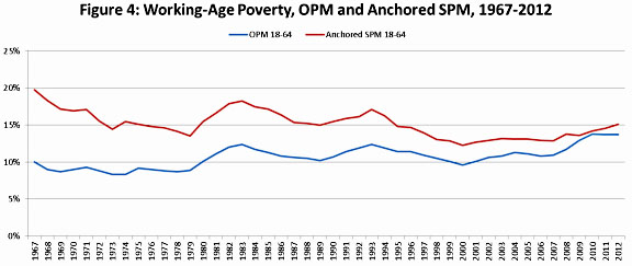
But at the risk of being a buzzkill, I want to reprint a chart I put up last month. It answers a simple question: if you count income from all the welfare programs we’ve put in place over the past half century, how have working-age folks done? The answer is in the red line in the chart below. The Great Society programs of the 60s got the working-age poverty rate down from 20 percent to 15 percent, but then we gave up. Since the mid-70s, the poverty rate has stayed stubbornly stuck at about 15 percent:

This is a chart to really keep in mind as you read the inevitable retrospectives. The overall poverty rate has gone down substantially in the past half century, but that’s largely because of the huge effect of Social Security on elderly poverty. But as much as this is a great achievement, it’s not what most people think of when you talk about “poverty.” Rather, they’re mostly thinking of working-age people who are either unemployed or earning tiny wages. And among those people, we simply haven’t done much for the past 40 years.
It’s probably not possible to eliminate poverty, or even to get it down to 5 percent or so. But we could do more if we wanted. We could make Medicaid more generous. We could raise the minimum wage and the EITC. We could, at an absolute minimum, decide not to cut food stamps. We could do all these things. All we need is a bit of empathy for the worst off among us and the will to do something about it.


