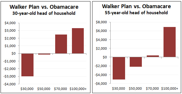
This is going to be the most anticlimactic blog post ever, but can you guess how Scott Walker’s health care plan compares to Obamacare for the poor? And how it compares for the upper middle class and the wealthy?
Damn. You guessed. But just to make it official, here are a couple of charts that show how the subsidies in the two plans compare at different income levels. I used the Kaiser calculator to estimate Obamacare subsidies and Walker’s written document to calculate tax credits under his plan. The chart on the left shows a 3-person family with 30-year-old parents. The chart on the right shows the same thing with older parents.
And have no fear: I chose $30,000 as the minimum income level because most families below that level qualify for Medicaid. And you guessed it: Walker’s plan slashes Medicaid too. So the poor and the working class get screwed by Walker no matter what their income level is.


