Max Ehrenfreund points us today to a new paper by a quartet of researchers that looks at lifetime incomes of various age groups. They find that middle-class income has stagnated and income inequality has gone up over the past few decades. None of that should come as a surprise.
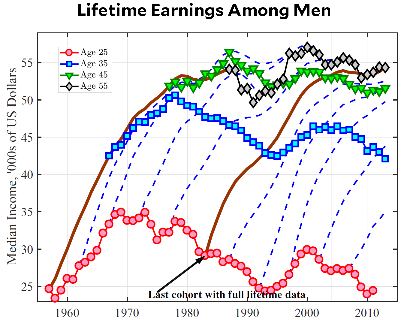
But there’s an interesting twist. Here’s their key chart for men. It’s busy and intimidating looking, but don’t worry. It will all make sense.

First off, look at the pink circles at the bottom. Those show the earnings of 25-year-old men who are just entering the labor market. Starting around 1973, their earnings began to plummet, from $35,000 to $25,000.
Now look at the gray diamonds at the top. Those show the earnings of 55-year-old men. They’ve gone up and down, but basically have stayed right around $55,000 the whole time.
In other words, the decline in lifetime earnings among men is almost entirely because the average earnings of young men have declined. They end up at the same place as earlier cohorts by the time they retire, but they never make up for the dismal earnings of the first ten or fifteen years of their working careers.
Don’t get too hung up on the precise numbers here. The authors use Social Security data, which they show is roughly equivalent to overall income data. However, if you use different data, or different measures of inflation, or different measures of income that include health benefits, you’ll get somewhat different results. However, the basic stagnation picture doesn’t change, and the difference between the earnings of young and old don’t change.
If this data is accurate, it means that we have one big cohort—roughly 25 to 40 years old—that’s struggling worse and worse every year, and another big cohort—roughly 40 to 65 years old—that’s stagnating but not declining. To the extent that economic stress among men helped power Donald Trump to the White House, it’s that younger cohort that should have done it. And this is indeed the cohort that Hillary Clinton struggled with the most.


