The Noun Project
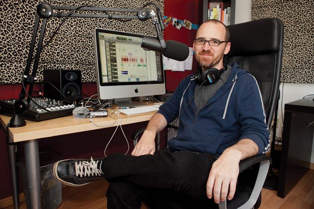
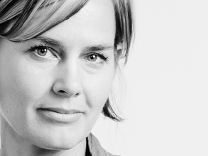
In college, Edward Boatman was a “pretty rigorous” sketcher of simple objects like “cranes and sequoias and trucks.” As his collection grew, “I thought to myself, ‘It would be really interesting if I had a way to visually communicate every noun or concept in existence.'” Hence the Noun Project. Run by Boatman and Sofya Polyakov (they’re married), the website collects and distributes iconography for a pittance. The 17,000 icons to date include existing ones you may recognize from airports, hospitals, and national parks—and loads more submitted by artists from around the globe. The key, Boatman says, is “really stripping the concept to the bare essence.” A bicycle’s spokes “would just be kind of erased. The gears—not really that important.” It may seem easy, but the design sense and craft that go into, say, a beer mug icon, he says, show that someone thought “that beer, that simple object, was special.”
Mother Jones: Tell me more about the origins of the project

Edward Boatman: It was one of those ideas that kind of slowly grew over time and has lots of layers to it. I kept a really detailed sketchbook. I did a lot of sketches of simple objects—all different kinds of cool things that inspired me as a kid. I noticed that they were all nouns and I started this big collection of sketches of all these different nouns.
MJ: You kept this collection on paper?
EB: Loose pieces of paper. It was very ragtag. It was just very much a concept at this point. And then when I was working at [design firm] Gensler in Santa Monica, I was putting together a lot of presentation boards for clients and I needed a way to communicate graphically—sometimes abstract concepts, sometimes concepts as simple as a bicycle or an airport—and I just couldn’t find a library online that could provide me with the content I needed. I talked to a lot of other designers with that same gripe, and so I took this old concept that I had back in college and steered it toward solving this real-world problem. We started as a resource for designers, but very quickly we got a lot of teachers reaching out to us, and people dealing with kids with autism. We realized that being able to communicate an idea through a symbol is powerful for pretty much anyone.
MJ: Why autistic kids?
Sofya Polyakov: A lot of autistic children tend to be visual learners and visual communicators. We started to learn about this because of the Noun Project. One of the things that caretakers or parents will do is put together a visual storyboard of your day. It’ll have a symbol for get out of bed, brush your teeth, have breakfast, put on clothes, put on your shoes, to help them get ready in the morning, for example. For one of our Iconathons we worked with the Boston schools—they have a lot of children with special needs, so they’ll use visual clues as well. For a child navigating a new school, having symbols for places like the cafeteria or gym or your classroom area is very helpful.
MJ: How did the project grow?

EB: It started with convincing Sofya it was a good idea. She’s kind of the business-and-operations brain. Then we brought on Scott Thomas, the design director of the 2008 Obama campaign, to help us execute the website. He’s a friend from college. We did a Kickstarter campaign in December 2010, and we’ve been building it out ever since. Last November we opened up our platform for submissions, so basically anyone can now upload a symbol that visually communicates a certain idea.
MJ: So you guys were doing all the illos before that?
EB: It was a mix between content we would create and stuff that was in the public domain, but had never been organized in one cohesive resource.
SP: An example is the AIGA DOT suite—the icons that you see at airports.
EB: And Hablamos Juntos, which is used in hospitals across the world. It’s a medical suite that hospitals use for way-finding systems. It was just kind of very far down on the internet where no one could find it, and we put it into our collection and gave it some exposure. The other one was the National Parks suite.
MJ: As someone who works in interactive storytelling, I was amazed by how difficult it can be to find visual representations of everyday objects.
SP: We have 17,000 now, but not everything that gets uploaded to our site is accepted. We’ve actually denied a fair share. We curate every single icon to make sure it’s up to our standards.
MJ: What are some of your favorites?
EB: If you search for the word “couple,” you’re gonna see a lot of different visual interpretations. I think that’s really interesting, really powerful; it kind of reflects our current society, and how there are a lot of different ways that two human beings can form a relationship. A really funny one was the “binder full of women.” Like 15 minutes after Mitt Romney said that, someone uploaded an icon. There’s an interesting one for global warming, graphically representing what that means to the planet.
MJ: What makes for a good icon?
EB: Stripping the concept to the bare essence is probably the most important characteristic. So what I always try to focus on when we do these design workshops is trying to get people to list out key attributes of the referent—the concept that the symbol is communicating—and then trying to figure out which ones are the most important.
MJ: How about, say, a bike?
EB: If you’re creating an icon for a tangible object then you’d probably start with a picture. What type of bike? A café bike in Amsterdam? A road bike that you’d see in Portland? Then you would look at the most important features—probably the frame and the tires and the seat. Everything else should kind of fall away to the background and not even be seen.
MJ: Did you have any outside inspiration? Like, were you familiar with Gerd Arntz, the renowned German iconographer, before you started this project?
EB: Yeah, he is a huge inspiration.
MJ: What do you like about his style?
EB: It’s timeless. He does the same reductive process that all the great icon designers do, just being able to communicate the core essence of a concept. That worked 100 years ago, and it will work 300 years in the future.
MJ: What other famous iconographers should we know about?
EB: There are icons that were developed for the Olympics that I think were great. Obviously, they need to be able to communicate a lot of complex concepts to a wide group of people who speak a variety of languages, so they have to do it through iconography. Probably the most famous is the 1974 AIGA collection.
MJ: Do you have any favorite Noun Project contributors?
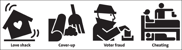
EB: Luis Prado. He’s extremely talented and very creative. He deals with concepts like “cheating” or “helicopter parents” or “shaking babies,” “child abuse”—so it’s very off-the-chart concepts that obviously need to be iconified, but not a lot of people want to take it on. One icon he did was for “impotent.” He just uploads whatever he comes up with. Like recently he added a symbol for “prostitute,” male and female.
SP: I’ve actually been thinking of doing an exhibit of his work somewhere, just because it’s so interesting.
MJ: We see municipal icons, on street signs and such, on a daily basis, but we don’t really think about the fact that someone sat down and created them. It’s interesting to think about how those icons shape our conceptions of the referent.
EB: Absolutely. The couple concept is a perfect example. I’m sure if the Noun Project were done in the 1950s, if you searched for “couple,” you never would have never seen two men together or two women together.
MJ: What’s up with the Iconathons?
SP: That idea came from our partnership with Code for America a couple years ago. We realized there’s a huge need for civic-minded symbols as new applications get developed. We recently did a cultural heritage Iconathon with the Metropolitan New York Library Council. Some of the referents suggested were like a card catalog—something that might not even be relevant nowadays, versus something like an e-book or an interactive exhibit or digital preservation. Libraries nowadays host maker spaces and business incubators, which is fairly new—so those are things that would really benefit from having an icon. Since we’re working with partners, everybody puts their suggestions in a shared Google document, and then we have review sessions where we narrow it down from 50 or 100 icons to a more manageable 30 icons for events.
MJ: But you’re creating the icons, not just the ideas, right?
SP: The ideas are predetermined, because that lets us focus on the actual execution during the event. There we have speakers that educate them on the topic, and Edward usually does a presentation about best design practices. After that, people break into groups and start laying out the concepts. All the Iconathons are open to the public. We try to get a good mix of not only designers but subject-matter experts and people who are just interested.
MJ: What’s next for you guys?
EB: Our application programming interface is going to be a huge step, because right now the only way you can interact with our content is by downloading it and putting it into Adobe Illustrator. But imagine all the interesting applications that can be built with our API: All of a sudden our content can be streamed into mobile messaging apps or applications that help people communicate ideas to kids with autism. There’s really a ton of applications that can be built. Because at the core this is about visually communicating ideas, emotions—basically anything—and that is important to so many people.