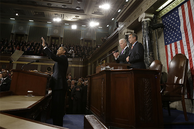
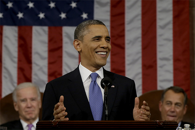
The folks over at Twitter have culled their massive data set of user reactions to the State of the Union and put together this nifty visualization of last night’s speech. On top, you’ll see a timeline of the speech with the volume of tweets at any particular moment reflected by the width of the color bar. The big spike in the middle is for Twitter users’ apparent enthusiasm for the President’s Mad Men reference. The timeline is divided into nine different subject areas (health care, budget, jobs, etc.), each of which pull from a set of keywords germane to that issue. You can also take a deeper dive by scrolling down the speech text to see which moments of the speech resonated with which parts of the country in the map to the right. In other words, see how Idaho zigged when the rest of the country zagged! And don’t fret, once you’re through playing here we’ve got some old-fashioned punditry from Kevin Drum and David Corn to soothe your Twitter-addled brain.
Bold. Brave. Beautiful.
Award-winning photojournalism.
Stunning video. Fearless conversations.
Looking for news you can trust?
Subscribe to the Mother Jones Daily to have our top stories delivered directly to your inbox.
Close
Thank you for subscribing!
By signing up, you agree to our privacy policy and terms of use, and to receive messages from Mother Jones and our partners.


