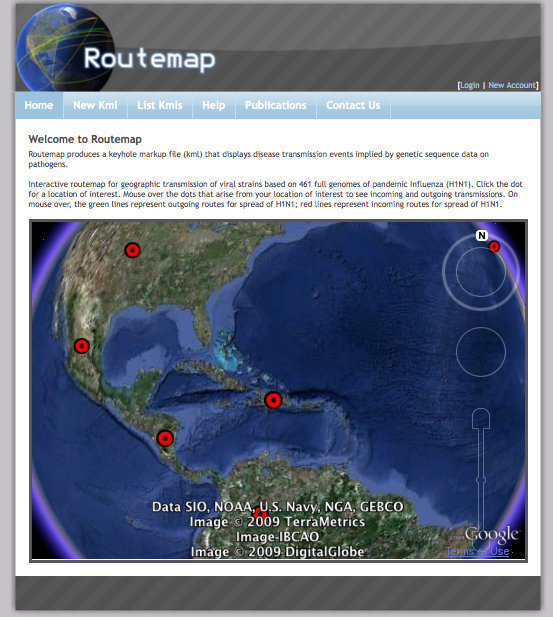
What happens when you mix a new flu with new supercomputing power with new superspeedy genome sequencing with a new trend toward the free sharing of scientific data with the supertool Google Earth?
You get Routemap: a visualization of disease transmission based on genetic sequencing.
Translation: You can see where and how disease is spreading in near-real time on a Google Earth map of the world. (FYI: You might have to install a Google Earth plug-in. You will have to leave this page to play with the map.)
It’s up and running right now for H1N1—an interactive routemap for the ongoing geographic transmission based on 461 full genomes of the pandemic flu. It’s like a vaccination against ignorance. Watch the flu spread. See where it came from and where it’s going. Get out of the way.
The visualizations are originally the outgrowth of a study linking many powerful computer systems to analyze huge amounts of genetic data collected from all publicly available isolated strains of the H5N1 virus—that is, of the avian flu. The researchers developed the means to visualize their results in Keyhole Markup Language for virtual globes. Their paper on flu tracking is in Cladistics.
Researchers can use the site to data share. The rest of us can watch the data spread.


