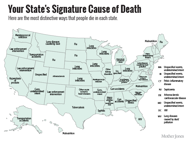
You might have seen a map floating around in the last couple days showing what the most distinctive cause of death is in each state (see methodology and full write-up here). It was a pretty neat (if clinical and somewhat creepy) way of showing some interesting trends going on around the country.
To make the map (published by the Centers for Disease Control and Prevention earlier this week), Francis P. Boscoe and Eva Pradhan, both at the New York State Department of Health, took data from 2001 to 2010 and calculated state rates of death for each of the 113 causes tracked by the CDC. They then divided those answers by the national rates of death for those specific causes. As Tech Times pointed out, the most distinctive cause doesn’t necessarily mean high numbers. Rather, the map shows a cause of death for each state that occurs at higher rates than in the rest of the country.
Here’s a look at what the CDC found, with the causes of death translated from medical speak into plain English:


